Yavneh Basketball Analytics and Analysis
All Time Season Data
| Season | Games Played | Overall Record | Win % | District Record | Points Scored | Points Scored / Game | Points Allowed | Points Allowed/ Game | Field Goals | Field Goal % | Three Pointers | Three Point % | Free Throws | Free Throw % | Rebounds | Rebounds / Game | Assists | Assists / Game | Steals | Steals / Game | Blocks | Blocks / Game | Turnovers | Turnovers / Game | Charges Taken | Charges Taken / Game |
|---|---|---|---|---|---|---|---|---|---|---|---|---|---|---|---|---|---|---|---|---|---|---|---|---|---|---|
| 1999-2000 | 22 | 17-5 | 77.00% | 6-0 | 1235 | 56.1 | 790 | 35.9 | 443/970 | 45.67% | 104/218 | 47.71% | 241/424 | 56.84% | 672 | 30.5 | 245 | 11.1 | 302 | 13.7 | 0 | 0.0 | 247 | 11.2 | 0 | 0.0 |
| 2000-2001 | 30 | 24-6 | 80.00% | N/A | 1769 | 59.0 | 1173 | 39.1 | 660/1389 | 47.52% | 131/301 | 43.52% | 318/484 | 65.70% | 806 | 26.9 | 339 | 11.3 | 360 | 12.0 | 0 | 0.0 | 348 | 11.6 | 0 | 0.0 |
| 2001-2002 | 36 | 28-8 | 78.00% | N/A | 2051 | 57.0 | 1675 | 46.5 | 750/1595 | 47.02% | 129/332 | 38.86% | 407/613 | 66.39% | 789 | 21.9 | 277 | 7.7 | 393 | 10.9 | 0 | 0.0 | 394 | 10.9 | 0 | 0.0 |
| 2002-2003 | 36 | 22-14 | 61.00% | N/A | 2164 | 60.1 | 1865 | 51.8 | 754/1739 | 43.36% | 195/539 | 36.18% | 461/699 | 66.00% | 923 | 25.6 | 377 | 10.5 | 336 | 9.3 | 65 | 1.8 | 427 | 11.9 | 17 | 0.5 |
| 2019-2020 | 34 | 31-3 | 91.00% | 12-0 | 2364 | 69.5 | 1580 | 46.5 | 975/1951 | 49.97% | 183/557 | 32.85% | 231/464 | 49.80% | 1145 | 33.7 | 752 | 22.1 | 529 | 15.6 | 134 | 3.9 | 494 | 14.5 | 45 | 1.3 |
| 2003-2004 | 37 | N/A | 1791 | 48.4 | 0.0 | 639/1688 | 37.86% | 151/502 | 30.08% | 362/626 | 57.83% | 932 | 25.2 | 421 | 11.4 | 413 | 11.2 | 49 | 1.3 | 619 | 16.7 | 16 | 0.4 | |||
| 2015-2016 | 33 | 21-12 | 64.00% | 9-8 | 1782 | 54.0 | 1527 | 46.3 | 685/1623 | 42.21% | 132/447 | 29.53% | 280/426 | 65.73% | 845 | 25.6 | 500 | 15.2 | 413 | 12.5 | 48 | 1.5 | 460 | 13.9 | 24 | 0.7 |
| 2017-2018 | 31 | 32-0 | 100.00% | 12-0 | 2109 | 68.0 | 1383 | 44.6 | 832/1681 | 49.49% | 130/449 | 28.95% | 315/521 | 60.46% | 1044 | 33.7 | 695 | 22.4 | 469 | 15.1 | 115 | 3.7 | 392 | 12.6 | 31 | 1.0 |
| 2016-2017 | 34 | 31-4 | 89.00% | 11-1 | 2088 | 61.4 | 1397 | 41.1 | 776/1824 | 42.54% | 144/501 | 28.74% | 392/637 | 61.54% | 1111 | 32.7 | 589 | 17.3 | 465 | 13.7 | 107 | 3.1 | 453 | 13.3 | 26 | 0.8 |
| 2013-2014 | 40 | 33-7 | 83.00% | 10-0 | 2302 | 57.6 | 1782 | 44.6 | 880/2027 | 43.41% | 168/592 | 28.38% | 374/641 | 58.35% | 1305 | 32.6 | 645 | 16.1 | 489 | 12.2 | 213 | 5.3 | 660 | 16.5 | 30 | 0.8 |
| 2007-2008 | 35 | 26-9 | 74.00% | N/A | 1854 | 53.0 | 1605 | 45.9 | 683/1675 | 40.78% | 118/419 | 28.16% | 370/618 | 59.87% | 1033 | 29.5 | 473 | 13.5 | 411 | 11.7 | 81 | 2.3 | 585 | 16.7 | 38 | 1.1 |
| 2009-2010 | 30 | 17-13 | 57.00% | N/A | 1603 | 53.4 | 1522 | 50.7 | 580/1362 | 42.58% | 95/338 | 28.11% | 348/604 | 57.62% | 822 | 27.4 | 428 | 14.3 | 286 | 9.5 | 95 | 3.2 | 483 | 16.1 | 50 | 1.7 |
| 2004-2005 | 36 | N/A | 1919 | 53.3 | 1941 | 53.9 | 702/1815 | 38.68% | 156/559 | 27.91% | 359/595 | 60.34% | 894 | 24.8 | 428 | 11.9 | 414 | 11.5 | 37 | 1.0 | 578 | 16.1 | 26 | 0.7 | ||
| 2008-2009 | 22 | 11-11 | 50.00% | N/A | 1061 | 48.2 | 1061 | 48.2 | 401/1050 | 38.19% | 68/244 | 27.87% | 191/379 | 50.40% | 618 | 28.1 | 323 | 14.7 | 234 | 10.6 | 35 | 1.6 | 393 | 17.9 | 38 | 1.7 |
| 2005-2006 | 34 | 18-16 | 53.00% | N/A | 1663 | 48.9 | 1773 | 52.1 | 569/1629 | 34.93% | 146/526 | 27.76% | 379/599 | 63.27% | 951 | 28.0 | 443 | 13.0 | 381 | 11.2 | 43 | 1.3 | 616 | 18.1 | 45 | 1.3 |
| 2006-2007 | 28 | 16-12 | 57.00% | N/A | 1499 | 53.5 | 1411 | 50.4 | 552/1453 | 37.99% | 147/581 | 25.30% | 248/472 | 52.54% | 843 | 30.1 | 427 | 15.3 | 380 | 13.6 | 35 | 1.3 | 526 | 18.8 | 49 | 1.8 |
| 1997-98 | 18 | 11-7 | 61.00% | 7-3 | 835 | 46.4 | 780 | 43.3 | 339/852 | 39.79% | 43/170 | 25.29% | 171/326 | 52.45% | 532 | 29.6 | 234 | 13.0 | 259 | 14.4 | 0 | 0.0 | 280 | 15.6 | 0 | 0.0 |
| 2014-2015 | 34 | 23-11 | 68.00% | 13-3 | 1817 | 53.4 | 1625 | 47.8 | 683/1647 | 41.47% | 85/358 | 23.74% | 366/616 | 59.42% | 1026 | 30.2 | 487 | 14.3 | 460 | 13.5 | 88 | 2.6 | 594 | 17.5 | 8 | 0.2 |
| 1998-99 | 19 | 13-6 | 68.00% | 7-1 | 816 | 42.9 | 683 | 35.9 | 310/778 | 39.85% | 36/161 | 22.36% | 160/270 | 59.26% | 531 | 27.9 | 158 | 8.3 | 200 | 10.5 | 0 | 0.0 | 280 | 14.7 | 0 | 0.0 |
| 2018-2019 | 34 | 27-7 | 79.00% | 12-0 | 2246 | 66.1 | 1669 | 49.1 | 924/1957 | 47.22% | 97/448 | 21.65% | 301/563 | 53.46% | 1239 | 36.4 | 706 | 20.8 | 534 | 15.7 | 111 | 3.3 | 551 | 16.2 | 32 | 0.9 |
Individual Career Data
| Player Name | Games Played | Points | Points / Game | Field Goals | Field Goal % | Three Pointers | Three Point % | Free Throw | Free Throw % | Rebounds | Rebounds / Game | Assists | Assists / Game | Steals | Steals / Game | Blocks | Blocks / Game | Turnovers | Turnovers / Game | Charges Taken | Charges Taken / Game |
|---|---|---|---|---|---|---|---|---|---|---|---|---|---|---|---|---|---|---|---|---|---|
| Itzy Ribald | 117 | 3080 | 26.3 | 1015/2042 | 50% | 400/900 | 44% | 650/804 | 81% | 961 | 8.2 | 259 | 2.2 | 332 | 2.8 | 13 | 0.1 | 265 | 2.3 | 4 | 0.0 |
| Jordan Prescott | 115 | 1771 | 15.4 | 613/1468 | 42% | 198/610 | 32% | 347/468 | 74% | 551 | 4.8 | 383 | 3.3 | 213 | 1.9 | 32 | 0.3 | 378 | 3.3 | 0 | 0.0 |
| Elan Kogutt | 112 | 1738 | 15.5 | 644 | 5.8 | 0.0 | 0.0 | 0.0 | 0.0 | 0.0 | |||||||||||
| Akiva Wolk | 1479 | #DIV/0! | 732 | #DIV/0! | #DIV/0! | 214 | #DIV/0! | #DIV/0! | #DIV/0! | #DIV/0! | |||||||||||
| David Naxon | 75 | 1455 | 19.4 | 527/1171 | 45% | 47/157 | 30% | 354/528 | 67% | 643 | 8.6 | 112 | 1.5 | 149 | 2.0 | 92 | 1.2 | 244 | 3.3 | 9 | 0.1 |
| Griffin Levine | 98 | 1418 | 14.5 | 518/1138 | 45% | 108/391 | 27% | 274/401 | 68% | 336 | 3.4 | 431 | 4.4 | 217 | 2.2 | 10 | 0.1 | 256 | 2.6 | 15 | 0.2 |
| Todd Nathan | 99 | 1378 | 13.9 | 488/1108 | 44% | 80/235 | 34% | 322/491 | 66% | 507 | 5.1 | 224 | 2.3 | 257 | 2.6 | 12 | 0.1 | 240 | 2.4 | 0 | 0.0 |
| Ofek Reef | 64 | 1329 | 20.8 | 517/819 | 63% | 40/118 | 34% | 255/355 | 72% | 629 | 9.8 | 285 | 4.5 | 226 | 3.5 | 62 | 1.0 | 119 | 1.9 | 22 | 0.3 |
| Adam Karnett | 1228 | #DIV/0! | #DIV/0! | 342 | #DIV/0! | 295 | #DIV/0! | #DIV/0! | #DIV/0! | #DIV/0! | |||||||||||
| Gavi Wolk | 118 | 1144 | 9.7 | 418/960 | 44% | 10/37 | 27% | 298/529 | 56% | 628 | 5.3 | 259 | 2.2 | 348 | 2.9 | 31 | 0.3 | 192 | 1.6 | 8 | 0.1 |
| Erez Krengel | 114 | 1048 | 9.2 | 328/948 | 35% | 143/505 | 28% | 249/365 | 68% | 374 | 3.3 | 159 | 1.4 | 166 | 1.5 | 13 | 0.1 | 214 | 1.9 | 26 | 0.2 |
| Jonah Eber | 128 | 1019 | 8.0 | 449/960 | 47% | 42/198 | 21% | 79/231 | 34% | 441 | 3.4 | 472 | 3.7 | 282 | 2.2 | 28 | 0.2 | 203 | 1.6 | 11 | 0.1 |
| Mason Schwaber | 93 | 1003 | 10.8 | 453/776 | 58% | 7/31 | 23% | 90/201 | 45% | 610 | 6.6 | 171 | 1.8 | 83 | 0.9 | 117 | 1.3 | 141 | 1.5 | 1 | 0.0 |
| Itai Guttman | 970 | #DIV/0! | 918 | #DIV/0! | #DIV/0! | #DIV/0! | 206 | #DIV/0! | #DIV/0! | #DIV/0! | |||||||||||
| Daniel Chernikov | 90 | 906 | 10.1 | 361/734 | 49% | 0/6 | 0% | 184/298 | 62% | 502 | 5.6 | 114 | 1.3 | 110 | 1.2 | 87 | 1.0 | 167 | 1.9 | 2 | 0.0 |
| Josh Abrams | 139 | 872 | 6.3 | 293/908 | 32% | 144/488 | 30% | 142/229 | 62% | 212 | 1.5 | 233 | 1.7 | 156 | 1.1 | 17 | 0.1 | 351 | 2.5 | 1 | 0.0 |
| Steve Levine | 99 | 854 | 8.6 | 321/772 | 42% | 91/304 | 30% | 121/195 | 62% | 245 | 2.5 | 326 | 3.3 | 256 | 2.6 | 13 | 0.1 | 245 | 2.5 | 6 | 0.1 |
| Joey Gottlieb | 735 | #DIV/0! | 477 | #DIV/0! | #DIV/0! | #DIV/0! | #DIV/0! | #DIV/0! | #DIV/0! | ||||||||||||
| Noah Rubinstein | 98 | 662 | 6.8 | 245/632 | 39% | 12/62 | 19% | 160/230 | 70% | 491 | 5.0 | 310 | 3.2 | 243 | 2.5 | 28 | 0.3 | 243 | 2.5 | 14 | 0.1 |
| Pierce Bell | 81 | 641 | 7.9 | 261/491 | 53% | 26/61 | 43% | 93/153 | 61% | 311 | 3.8 | 134 | 1.7 | 133 | 1.6 | 37 | 0.5 | 106 | 1.3 | 14 | 0.2 |
| Tyler Winton | 96 | 631 | 6.6 | 229/605 | 38% | 119/381 | 31% | 54/96 | 56% | 218 | 2.3 | 305 | 3.2 | 246 | 2.6 | 34 | 0.4 | 158 | 1.6 | 2 | 0.0 |
| Joseph Belleli | 61 | 629 | 10.3 | 252/518 | 49% | 5/14 | 36% | 120/191 | 63% | 218 | 3.6 | 190 | 3.1 | 145 | 2.4 | 0 | 0.0 | 228 | 3.7 | 0 | 0.0 |
| Brad Alhadef | 88 | 506 | 5.8 | 203/528 | 38% | 51/220 | 23% | 49/136 | 36% | 229 | 2.6 | 241 | 2.7 | 163 | 1.9 | 10 | 0.1 | 161 | 1.8 | 13 | 0.1 |
| Amitai Scott | 112 | 505 | 4.5 | 170/555 | 31% | 113/413 | 27% | 52/74 | 70% | 219 | 2.0 | 178 | 1.6 | 151 | 1.3 | 2 | 0.0 | 188 | 1.7 | 6 | 0.1 |
| Simon Chafetz | 117 | 490 | 4.2 | 194/468 | 42% | 18/63 | 29% | 84/159 | 53% | 269 | 2.3 | 112 | 1.0 | 90 | 0.8 | 4 | 0.0 | 188 | 1.6 | 2 | 0.0 |
| Jeremy Issakhrian | 105 | 485 | 4.6 | 185/475 | 39% | 56/201 | 28% | 59/105 | 56% | 161 | 1.5 | 128 | 1.2 | 144 | 1.4 | 3 | 0.0 | 256 | 2.4 | 1 | 0.0 |
| Sam Pulitzer | 102 | 395 | 3.9 | 152/406 | 37% | 10/38 | 26% | 81/159 | 51% | 350 | 3.4 | 77 | 0.8 | 102 | 1.0 | 21 | 0.2 | 144 | 1.4 | 47 | 0.5 |
| Jonathan Ochstein | 97 | 381 | 3.9 | 151/343 | 44% | 1/10 | 10% | 78/126 | 62% | 346 | 3.6 | 140 | 1.4 | 124 | 1.3 | 12 | 0.1 | 134 | 1.4 | 5 | 0.1 |
| David Abrams | 44 | 367 | 8.3 | 154/360 | 43% | 20/69 | 29% | 39/68 | 57% | 192 | 4.4 | 54 | 1.2 | 99 | 2.3 | 0 | 0.0 | 93 | 2.1 | 0 | 0.0 |
| Zach Epstein | 83 | 361 | 4.3 | 131/339 | 39% | 69/201 | 34% | 30/54 | 56% | 118 | 1.4 | 66 | 0.8 | 68 | 0.8 | 2 | 0.0 | 81 | 1.0 | 6 | 0.1 |
| Noah Weiss | 65 | 358 | 5.5 | 149/257 | 58% | 0/2 | 0% | 60/105 | 59% | 319 | 4.9 | 66 | 1.0 | 90 | 1.4 | 55 | 0.8 | 83 | 1.3 | 2 | 0.0 |
| Ben Kogutt | 121 | 356 | 2.9 | 135/350 | 39% | 0/0 | 0% | 86/182 | 47% | 278 | 2.3 | 68 | 0.6 | 90 | 0.7 | 20 | 0.2 | 131 | 1.1 | 12 | 0.1 |
| Jake Greif | 115 | 324 | 2.8 | 125/321 | 39% | 0/2 | 0% | 74/192 | 39% | 485 | 4.2 | 65 | 0.6 | 71 | 0.6 | 130 | 1.1 | 107 | 0.9 | 60 | 0.5 |
| Bo Fraser | 78 | 310 | 4.0 | 131/368 | 36% | 1/6 | 17% | 47/99 | 47% | 341 | 4.4 | 132 | 1.7 | 71 | 0.9 | 10 | 0.1 | 133 | 1.7 | 17 | 0.2 |
| Noam Scott | 83 | 237 | 2.9 | 85/218 | 39% | 18/61 | 30% | 59/112 | 53% | 183 | 2.2 | 313 | 3.8 | 154 | 1.9 | 0 | 0.0 | 208 | 2.5 | 0 | 0.0 |
| Sam Fine | 66 | 234 | 3.5 | 104/278 | 37% | 2/15 | 13% | 26/52 | 50% | 138 | 2.1 | 38 | 0.6 | 77 | 1.2 | 0 | 0.0 | 114 | 1.7 | 0 | 0.0 |
| Josh Karnett | 106 | 233 | 2.2 | 82/257 | 32% | 38/154 | 25% | 31/83 | 37% | 138 | 1.3 | 130 | 1.2 | 101 | 1.0 | 8 | 0.1 | 128 | 1.2 | 60 | 0.6 |
| Micah Romaner | 96 | 228 | 2.4 | 97/274 | 35% | 0/7 | 0% | 34/72 | 47% | 304 | 3.2 | 58 | 0.6 | 56 | 0.6 | 36 | 0.4 | 98 | 1.0 | 3 | 0.0 |
| Miles Pulitzer | 89 | 222 | 2.5 | 75/209 | 36% | 22/99 | 22% | 50/99 | 51% | 132 | 1.5 | 189 | 2.1 | 94 | 1.1 | 10 | 0.1 | 154 | 1.7 | 6 | 0.1 |
| Aviv Schor | 55 | 216 | 3.9 | 98/207 | 47% | 0/3 | 0% | 20/48 | 42% | 190 | 3.5 | 56 | 1.0 | 50 | 0.9 | 6 | 0.1 | 67 | 1.2 | 2 | 0.0 |
| Zach Bernstein | 63 | 170 | 2.7 | 73/134 | 54% | 6/24 | 25% | 18/39 | 46% | 151 | 2.4 | 104 | 1.7 | 85 | 1.3 | 11 | 0.2 | 74 | 1.2 | 3 | 0.0 |
| Eli Tabaria | 24 | 170 | 7.1 | 60/157 | 38% | 29/105 | 28% | 21/37 | 57% | 39 | 1.6 | 39 | 1.6 | 29 | 1.2 | 1 | 0.0 | 52 | 2.2 | 0 | 0.0 |
| Ben Tabaria | 63 | 161 | 2.6 | 64/108 | 59% | 0/0 | 0% | 33/60 | 55% | 109 | 1.7 | 15 | 0.2 | 23 | 0.4 | 0 | 0.0 | 47 | 0.7 | 0 | 0.0 |
| William Zalstein | 101 | 146 | 1.4 | 50/131 | 38% | 6/22 | 27% | 40/102 | 39% | 160 | 1.6 | 289 | 2.9 | 187 | 1.9 | 1 | 0.0 | 249 | 2.5 | 3 | 0.0 |
| Baruch Shawel | 76 | 145 | 1.9 | 49/176 | 28% | 26/104 | 25% | 21/40 | 53% | 58 | 0.8 | 47 | 0.6 | 42 | 0.6 | 1 | 0.0 | 79 | 1.0 | 2 | 0.0 |
| Michael San Soucie | 91 | 141 | 1.5 | 53/126 | 42% | 0/4 | 0% | 35/66 | 53% | 187 | 2.1 | 87 | 1.0 | 67 | 0.7 | 6 | 0.1 | 151 | 1.7 | 7 | 0.1 |
| Ben Drori | 57 | 125 | 2.2 | 50/156 | 32% | 6/36 | 17% | 19/40 | 48% | 88 | 1.5 | 25 | 0.4 | 39 | 0.7 | 2 | 0.0 | 69 | 1.2 | 0 | 0.0 |
| Zak Schultz | 50 | 118 | 2.4 | 41/166 | 25% | 19/106 | 18% | 17/32 | 53% | 57 | 1.1 | 17 | 0.3 | 42 | 0.8 | 4 | 0.1 | 36 | 0.7 | 1 | 0.0 |
| Austin Litoff | 53 | 114 | 2.2 | 42/108 | 39% | 1/2 | 50% | 29/53 | 55% | 181 | 3.4 | 35 | 0.7 | 54 | 1.0 | 15 | 0.3 | 60 | 1.1 | 4 | 0.1 |
| Reece Parker | 65 | 114 | 1.8 | 40/92 | 43% | 1/18 | 6% | 33/54 | 61% | 60 | 0.9 | 36 | 0.6 | 37 | 0.6 | 3 | 0.0 | 54 | 0.8 | 7 | 0.1 |
| Eli Minsky | 55 | 105 | 1.9 | 40/103 | 39% | 7/37 | 19% | 18/30 | 60% | 122 | 2.2 | 42 | 0.8 | 27 | 0.5 | 7 | 0.1 | 30 | 0.5 | 2 | 0.0 |
| Bud Shawel | 31 | 105 | 3.4 | 45/120 | 38% | 4/13 | 31% | 11/20 | 55% | 60 | 1.9 | 5 | 0.2 | 11 | 0.4 | 0 | 0.0 | 23 | 0.7 | 0 | 0.0 |
| Nathan Rafaelov | 41 | 102 | 2.5 | 36/102 | 35% | 22/60 | 37% | 8/11 | 73% | 29 | 0.7 | 11 | 0.3 | 16 | 0.4 | 0 | 0.0 | 34 | 0.8 | 0 | 0.0 |
| Liad Guttman | 32 | 81 | 2.5 | 35/95 | 37% | 2/21 | 10% | 9/27 | 33% | 83 | 2.6 | 28 | 0.9 | 35 | 1.1 | 2 | 0.1 | 41 | 1.3 | 0 | 0.0 |
| Ian Rasmussen | 42 | 77 | 1.8 | 30/86 | 35% | 0/0 | 0% | 17/47 | 36% | 106 | 2.5 | 3 | 0.1 | 20 | 0.5 | 14 | 0.3 | 21 | 0.5 | 0 | 0.0 |
| Joe Lerer | 67 | 74 | 1.1 | 30/83 | 36% | 4/21 | 19% | 10/20 | 50% | 102 | 1.5 | 42 | 0.6 | 43 | 0.6 | 3 | 0.0 | 38 | 0.6 | 1 | 0.0 |
| Charlie Saginaw | 28 | 71 | 2.5 | 31/64 | 48% | 0/1 | 0% | 9/30 | 30% | 117 | 4.2 | 5 | 0.2 | 12 | 0.4 | 2 | 0.1 | 27 | 1.0 | 7 | 0.3 |
| Benny Fried | 44 | 65 | 1.5 | 24/60 | 40% | 2/9 | 22% | 15/23 | 65% | 56 | 1.3 | 26 | 0.6 | 32 | 0.7 | 2 | 0.0 | 46 | 1.0 | 4 | 0.1 |
| Sam Schultz | 26 | 62 | 2.4 | 23/85 | 27% | 9/49 | 18% | 7/20 | 35% | 35 | 1.3 | 32 | 1.2 | 35 | 1.3 | 1 | 0.0 | 23 | 0.9 | 0 | 0.0 |
| Simcha Malina | 32 | 59 | 1.8 | 25/59 | 42% | 0/0 | 0% | 9/35 | 26% | 79 | 2.5 | 13 | 0.4 | 6 | 0.2 | 4 | 0.1 | 26 | 0.8 | 0 | 0.0 |
| Nachi Zucker | 26 | 53 | 2.0 | 25/76 | 33% | 2/6 | 33% | 1/6 | 17% | 32 | 1.2 | 10 | 0.4 | 11 | 0.4 | 5 | 0.2 | 17 | 0.7 | 2 | 0.1 |
| Avraham Adhamy | 29 | 52 | 1.8 | 25/74 | 34% | 0/0 | 0% | 2/7 | 29% | 55 | 1.9 | 8 | 0.3 | 18 | 0.6 | 0 | 0.0 | 36 | 1.2 | 1 | 0.0 |
| Ethan Prescott | 48 | 45 | 0.9 | 18/62 | 29% | 0/0 | 0% | 9/22 | 41% | 58 | 1.2 | 13 | 0.3 | 8 | 0.2 | 3 | 0.1 | 22 | 0.5 | 0 | 0.0 |
| Sammy Weyser | 24 | 34 | 1.4 | 8/17 | 47% | 1/3 | 33% | 17/20 | 85% | 26 | 1.1 | 13 | 0.5 | 8 | 0.3 | 0 | 0.0 | 14 | 0.6 | 1 | 0.0 |
| Ilan Attar | 18 | 29 | 1.6 | 11/47 | 23% | 2/14 | 14% | 5/9 | 56% | 16 | 0.9 | 9 | 0.5 | 14 | 0.8 | 1 | 0.1 | 20 | 1.1 | 0 | 0.0 |
| Micah Steinbrecher | 33 | 27 | 0.8 | 13/43 | 30% | 0/0 | 0% | 1/13 | 8% | 50 | 1.5 | 1 | 0.0 | 7 | 0.2 | 2 | 0.1 | 37 | 1.1 | 0 | 0.0 |
| Yoni Sallmander | 10 | 21 | 2.1 | 10/25 | 38% | 1/2 | 50% | 0/0 | 0% | 4 | 0.4 | 2 | 0.2 | 2 | 0.2 | 0 | 0.0 | 6 | 0.6 | 0 | 0.0 |
| Seth Gerstenfeld | 25 | 18 | 0.7 | 8/28 | 29% | 0/0 | 0% | 2/14 | 14% | 35 | 1.4 | 7 | 0.3 | 8 | 0.3 | 0 | 0.0 | 22 | 0.9 | 5 | 0.2 |
| Zach Greenberg | 1 | 16 | 16.0 | 6/8 | 75% | 4/6 | 67% | 0/0 | 0% | 0 | 0.0 | 0 | 0.0 | 0 | 0.0 | 0 | 0.0 | 3 | 3.0 | 0 | 0.0 |
| Ben Fine | 1 | 14 | 14.0 | 7/10 | 70% | 0/0 | 0% | 0/0 | 0% | 5 | 5.0 | 0 | 0.0 | 1 | 1.0 | 0 | 0.0 | 0 | 0.0 | 0 | 0.0 |
| Chad Davis | 16 | 11 | 0.7 | 5/16 | 31% | 0/3 | 0% | 1/4 | 25% | 10 | 0.6 | 2 | 0.1 | 5 | 0.3 | 0 | 0.0 | 8 | 0.5 | 0 | 0.0 |
| Reece Neiman | 10 | 9 | 0.9 | 4/9 | 44% | 0/1 | 0% | 1/6 | 17% | 8 | 0.8 | 3 | 0.3 | 2 | 0.2 | 2 | 0.2 | 7 | 0.7 | 1 | 0.1 |
| Lee Gelsky | 12 | 7 | 0.6 | 2/8 | 25% | 0/3 | 0% | 3/6 | 50% | 7 | 0.6 | 2 | 0.2 | 2 | 0.2 | 4 | 0.3 | 5 | 0.4 | 3 | 0.3 |
| Jordan Brafman | 29 | 6 | 0.2 | 3/20 | 15% | 0/0 | 0% | 0/1 | 0% | 34 | 1.2 | 6 | 0.2 | 18 | 0.6 | 0 | 0.0 | 11 | 0.4 | 0 | 0.0 |
| Jacob Lampert | 16 | 5 | 0.3 | 2/12 | 17% | 1/7 | 14% | 0/2 | 0% | 9 | 0.6 | 6 | 0.4 | 7 | 0.4 | 1 | 0.1 | 9 | 0.6 | 0 | 0.0 |
| Pinhas Kirik | 10 | 5 | 0.5 | 2/22 | 9% | 0/2 | 0% | 1/3 | 33% | 5 | 0.5 | 1 | 0.1 | 1 | 0.1 | 0 | 0.0 | 6 | 0.6 | 0 | 0.0 |
| Will Naxon | 7 | 4 | 0.6 | 2/9 | 22% | 0/3 | 0% | 0/0 | 0% | 4 | 0.6 | 2 | 0.3 | 0 | 0.0 | 0 | 0.0 | 2 | 0.3 | 0 | 0.0 |
| Arye Zucker | 1 | 4 | 4.0 | 2/8 | 25% | 0/0 | 0% | 0/2 | 0% | 1 | 1.0 | 0 | 0.0 | 0 | 0.0 | 0 | 0.0 | 1 | 1.0 | 0 | 0.0 |
| Goldberg | 5 | 4 | 0.8 | 2/6 | 33% | 0/0 | 0% | 0/0 | 0% | 6 | 1.2 | 2 | 0.4 | 4 | 0.8 | 0 | 0.0 | 4 | 0.8 | 0 | 0.0 |
| Robert Ames | 3 | 2 | 0.7 | 1/6 | 17% | 0/0 | 0% | 0/1 | 0% | 6 | 2.0 | 1 | 0.3 | 1 | 0.3 | 0 | 0.0 | 4 | 1.3 | 0 | 0.0 |
| Daniel Moskowitz | 5 | 0 | 0.0 | 0/2 | 0% | 0/0 | 0% | 0/2 | 0% | 1 | 0.2 | 1 | 0.2 | 3 | 0.6 | 0 | 0.0 | 1 | 0.2 | 0 | 0.0 |
| Ophir Nissanov | 4 | 0 | 0.0 | 0/1 | 0% | 0/1 | 0% | 0/0 | 0% | 0 | 0.0 | 1 | 0.3 | 2 | 0.5 | 0 | 0.0 | 1 | 0.3 | 0 | 0.0 |
| Brian Benaim | 4 | 0 | 0.0 | 0/4 | 0% | 0/0 | 0% | 0/0 | 0% | 4 | 1.0 | 2 | 0.5 | 1 | 0.3 | 0 | 0.0 | 4 | 1.0 | 0 | 0.0 |
| Josh Issakhrian | 1 | 0 | 0.0 | 0/0 | 0% | 0/0 | 0% | 0/0 | 0% | 0 | 0.0 | 1 | 1.0 | 1 | 1.0 | 0 | 0.0 | 0 | 0.0 | 0 | 0.0 |
| Dani Golan | 5 | 0 | 0.0 | 0/1 | 0% | 0/0 | 0% | 0/0 | 0% | 1 | 0.2 | 0 | 0.0 | 1 | 0.2 | 0 | 0.0 | 0 | 0.0 | 0 | 0.0 |
| Jonathan Mishler | 3 | 0 | 0.0 | 0/2 | 0% | 0/0 | 0% | 0/0 | 0% | 1 | 0.3 | 0 | 0.0 | 0 | 0.0 | 0 | 0.0 | 0 | 0.0 | 0 | 0.0 |
| Daniel Wald | 3 | 0 | 0.0 | 0/2 | 0% | 0/0 | 0% | 0/0 | 0% | 0 | 0.0 | 0 | 0.0 | 0 | 0.0 | 0 | 0.0 | 0 | 0.0 | 0 | 0.0 |
Data Analysis
Developed by Ezra Troy – reach out for data and sports analytics projects.
Offensive and Defensive Value
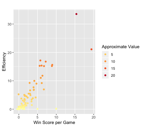
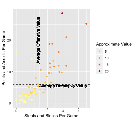
This plot takes every player and charts them based on their Approximate Offensive (Points and Assists per game) and Defensive (Steals and Blocks per game) Value added to the team. The color represents total Approximate Value of the player, with darker colors being higher total value. The dashed lines are what the average player value of each component is, with players above or to the right of those lines being better than average, while players below or to the left are worse.
Heatmap
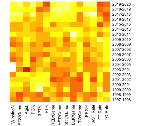
This chart compares each seasons teams to each other in a wide range of different statistics, with the lighter colors being higher values and the darker colors being lower values. For most of the statistics, having a higher value is better, but for Agst. (Points Scored Against per Game), TO/Game (Turnovers per Game) and TO rate, teams are looking to have a lower value.
Don't see your stats here?
Reach out to us and we'll do what we can to update the site with your career statistics.


